Saturday, February 25, 2012

Metal ATCs


I belong to an ATC (Artist Trading Card) club, made up of nine fascinating and wildly different ladies who like to play with paper and ink.  Each month one of us chooses a theme and teaches a technique after the swap.  The only rule is that each piece of art must be 3½“ by 2 ½."  Some of us make nine different cards, and others make nine of the same design.  We’re in our fourth year, and I have four thick binders of amazing art to look through and be inspired by. We often go on hilarious roadtrips together to visit stamp stores or craft conventions.  In November, we skip the cards and do some sort of project; this year we are making centerpieces for a local nursing home.

This month’s theme was metal, and I thought I’d choose a few of mine to share with you, plus my favorite from the swap. Ann gave me permission to show it to you and generously shared the directions.

Ann embossed the gold foil with Tim Holtz's Patchwork embossing folder (from the Bingo and Patchwork set), colored it with alcohol inks, wiped the raised surfaces with Ranger's Archival Ink in sepia, and added the small clock charm.  She did an amazing job positioning the embossing folder to maximize the design onto a small canvas. Isn't it beautiful? 


Materials used in top three ATCs:
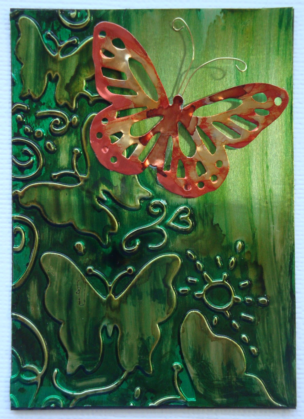
Diamond embossing plate Ten Seconds Studio small eraser tool set
Ranger Alcohol Inks


Monday, February 6, 2012

For the love of china

The theme of Just-Rite's Friday Challenge #065 is "For the love of..." Their Warm and Cosy Medallion Labels stamps remind me of Delft pottery, and I do love china and pottery.  When we go antiquing, my friend Nancy and I always linger over the beautiful old plates, cups and teapots. Designs on china, designs on paper -- it's all about the patterns and the colors.  So here is my entry:


Materials used:
Copic Sketch markers Y18, B18, B24

I don't have a clue as to where I got the cup stamp; there's no company name on the block. 

Saturday, February 4, 2012

Just-Rite class sample

I teach classes at Beautiful Impressions in Westbrook, Connecticut. I’ve waxed so enthusiastically about the new Just-Rite stamps and dies that the owner Terri asked me to make up a class using them.  She put in a big Just-Rite order, so if you’re out our way, come in and stock up.  I could just keep making new samples continuously; the Just-Rite stamps and dies are so classy and interchangeable.


I had half a ream of light blue card stock (left from a large choir project) that I wanted to make use of, so instead of working from design paper up, I worked from card stock down. As a result, I broke my cardinal rule in making samples and used a single sheet of design paper that I had, because it was the only thing that worked for the blue and brown Happy Birthday card.  I finally located five more sheets – in Australia! – and ordered them.  In case they don’t come in time, I think I can make a substitute by using background stamps on the same blue cardstock and maybe highlighting it with a white pen. Crazy woman, there’s a reason for the rules.

Materials used:
EK Fleur de Lis punch
Paper: Fresh Print Déjà Views Blue Raspberry Paisley


Friday, February 3, 2012

Cheery Lynn Designs sweetheart challenge in metal

Another of my goals for the new year is to enter some card challenges, so here is my entry for the current Cheery Lynn Designs challenge. I love Cheery Lynn dies and own a lot of them; their intricate designs cut cleanly on my Cuttlebug, usually with a single pass. This month's theme for our ATC club is metal, so I decided to carry that idea through to this challenge. I cut the Cheery Lynn Celtic heart out of TenSeconds Studio Kiss Me Pink 40g sheet metal. Then I embossed a 4-inch square of silver sheet metal in a Cuttlebug damask stripe folder, colored it with currant and denim alcohol inks, and rolled two opposing corners with a wooden skewer. Cutting out metal with dies sharpens them beautifully.


The final touch was the pink and dark blue flowers cut with Cheery Lynn's medium rose die, my new favorite. I applied the denim and pine needles alcohol inks and Brilliance pearlescent orchid ink to white coffee filters, sprayed them with Maya silver-plated metallic mist, and scrunched them on a small brad. Then I added just a hint of popsicle (lavender) Glimmer Mist on the pink flower to coordinate it better with the alcoholic ink blend on the embossed metal.  My fingers tips are a deep shade of purple; I need to remember to wear rubber gloves when applying colored inks.

Materials used:
TenSeconds Studio Kiss Me Pink sheet metal
Cuttlebug damask stripe folder
Distress inks: currant, denim, pine needles
Brilliance pearlescent orchid ink
Maya silver-plated metallic mist, Popsicle Glimmer Mist
Paper: Recollections by Michael's, Que Sera Sera by KC, blue steel by The Paper Company
Stamp: French Script by Stampin' Up


Thursday, February 2, 2012

A week in the cave

Tomorrow turned into over a week while we were without Internet, TV and phone, thanks to AT&T. To give the company credit, all the people it sent out to fix the outage were very nice, but the problem was multi-layered and mostly in lines on the main road.  How attached we've become to technology. I am old enough to remember making trans-Atlantic phone calls during which you had to pause after speaking or end up talking over the recipient's response, because there was a 30-second delay in transmission. This week I felt as though we were living in a cave; our smart phones were our only lines to the outside. 

So, on to the promised book review: A Small Death in the Great Glen by A.D. Scott.  I picked it up because it came with a recommendation by Peter Robinson, one of my favorite mystery writers.  The first couple of chapters felt very familiar, as though I'd read the book before or seen it produced on PBS, but judging by its publication date the latter is not likely.  The hub of the story is the newsroom of the weekly Highland Gazette in 1950's Inverness. The new publisher John McAllister is trying to push the small-town ad and gossip rag into serious modern journalism. The sub-editor "and all around fusspot" Don McLeod morphs too quickly from crusty resistance to helpful accomplice. The two remaining members of the staff include a female typist Joanne Ross, who is trying to escape from her abusive husband and will likely end up the love interest of the crusading publisher, and a naive cub reporter Rob, who still lives at home and is as likeable as a furry puppy.


A young boy, Jamie, has been found naked and drowned in the canal, and the coroner later finds that he has been interfered with and murdered. Joanne's daughters Annie and Wee Jean, were the last to see him alive. They spin such a fanciful tale about "a hoodie crow" that no one takes them seriously, although the reader will start putting together the pieces before the denouement. Annie is one of the best written characters in the novel. Interwoven into the tale is a sailor who has jumped ship from a Russian freighter, a family of Scots tinkers who live by their own code, greedy politicians, a former Polish prisoner-of-war who has stayed on to marry the daughter of Italian imigrants who own a thriving chip shop, McAllister's own tortured history, and the various prejudices against outsiders, women, and change. 

Scott's debut novel holds promise, enough that I ordered the second in the series, A Double Death on the Black Isle.  Character development is not quite as "probing" as advertised, but it's on its way and not limited to just the main players.  A few plot twists are telegraphed or manipulated unnaturally, as when intelligent people ignore the obvious in order to maintain suspense. I became annoyed at some of the characters at times, but still cared what happened to them. In fact, my annoyance was due to the fact that the bones of the book are too good to settle for the facile.  I imagine Scott will improve with time.  She does provide a fascinating insight into post-war Scotland, with local color and a strong burr limning the strained relationships.

The most delightful part of the whole book, however, was learning the word "dreich," which sounds like what it means: the gray, damp, and cold weather Scotland is prone to and of which New England has its fair share.  I give the book a 6 out of 10.