Thursday, August 9, 2012

STEAMPUNK ATCs


As I've mentioned before, I belong to an ATC Club (Artist's Trading Cards) that has been meeting at our local stamp store for the past four years. Five of the members are original to the group.  We meet once a month, trade our ATCs, talk a lot, and someone does a demo. Lately, we've been meeting earlier for dinner at a local restaurant.  We go on road trips to stamp stores, shows, and to each other's homes to work on projects.  The ATC ladies are some of my dearest friends; they are so funny, creative, and supportive.  

The gentleman to the right is from the Stampers Anonymous Tim Holtz collection, CMS072. The trimmed bird cage is a Memory Box Poppy Stamp die.


Each of us takes a turn to select the theme for the month, and this month it was Steampunk.  Because we select the themes a year in advance, we've been collecting gears, stamps, hardware, charms, and odd bits and pieces for months.  We all admitted that we have enough stuff to do hundreds of steampunk ATCs.

I used a combination of rubber and digital stamps. The lady to your right is the first one I picked up; it's a Stampington rubber stamp called "Temptress." I cut out a stencil of her to white wash the design paper background, blurring the edges, before embossing the lady on top.


Viva Las Vegas Stamps has a great selection of steampunk stamps, including the darling elephant and giraffe ones here.  I also bought the horse, fish, cat, and camel. 

Leslie named the elephant "Metalaphant."


The elephant and giraffe paper is something I've had in my travel stash forever, made by Paper Pizazz. 

VLV also carries the coolest steampunk tape, which comes in big rolls like packing tape. I used the hinge design to connect the two parts of my Crystal Palace ATC, but VLV also carries O-ring, tower bolt, and strap designs. 


Because steampunk merges the Victorian and the industrial, I made an historical ATC celebrating the Crystal Palace. (You can see shades of my former career as a teacher of British literature here.) Our group likes ATCs that give the background of things. The image of the Crystal Palace is off the Internet and printed on design paper. The Victorian gentleman is also a VLV stamp.
 
The Crystal Palace was a cast-iron and plate-glass building (1,851 feet long by 128 feet high) originally erected in Hyde Park, London, to house the Great Exhibition of 1851. The six-month event, originally conceived of by artist and inventor Henry Cole and heartily supported by Prince Albert, was designed to showcase the industrial, military and econmic superiority of Great Britain. Over 6 million visitors viewed more than 14,000 displays and inventions from all over the British Empire, including a Jacquard loom, an envelope machine, a stuffed elephant, a collection of the largest gems ever mined, the McCormick reaper, daguerreotopes of illustrious Americans by Matthew Brady, new Colt firearms, and a dirigible. The Crystal Palace was almost outshone by the park in which it stood, which contained enormous sculptures, exotic plants, and a magnificent series of fountains. Some 120,000 gallons of water were piped through daily, an engineering feat in itself. The Crystal Palace was later moved to Sydenham Hill and was the site of many events until destroyed by fire in 1936.


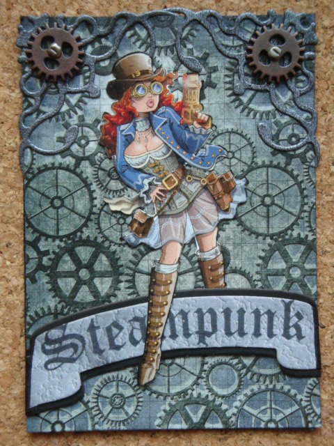
The rather bawdy steampunk chick is a Kenny K digital stamp; this one is called Scarlett West. The Spellbinders banner die is designed to match JustRite stamps, but I stretched a VLV "Steampunk" stamp in a curve to stamp on it instead. The background paper is DCWV's Tattered Time matstack, which is just full of great embossed papers (4.5" by 6.5').   

The gears on these ATCs are from various sources: Tim Holtz, watch parts I bought on E-bay, washers from hardware stores, and charms from bead shops, stamp stores, and E-bay.


Vincent Ballard provides beautiful free digital images on his blog Crafty Moments, and he's really into steampunk lately. This is my favorite and was so much fun to color and decorate -- although I am still peeling  Glossy Accents off my finger tips.

Check out Vincent's blog. His artwork and cards are amazing, and he's such a nice guy. Some stamp company ought to commission him to design their stamps.


I love cats even more than I love stamps, and their mysterious ways just lend themselves to steampunkery. The globe is an Internet image cut out, the cat and the saying are VLV, and the cat's glasses are twisted jump rings I bought at the bead shop. 

It's hard to tell in the picture, but the eyes and the fur are enhanced with Twinkling H20s.


The corners on this ATC and the bawdy chick ATC are made with Cheery Lynn Lace Corner Deco Dies B.


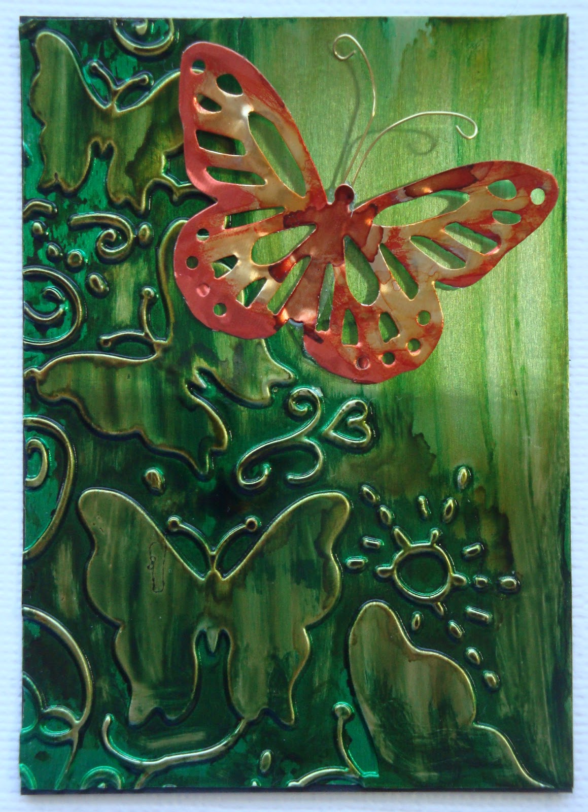
This last steampunk ATC is alcohol inks on dry embossed metal; the F.E. Linus stamp is Stampendous; and the background page is from an old literature text of my mother's. I have trouble tearing up a book, even an old one, but the pages in this one are yellowed and crumbly, and I have all the poems and prose in other texts.  I thought "The Bird" poem by 17th-century poet Henry Vaughan was propitious in the circumstances.

There are nine ATCs and nine ladies in our group, the same number of pockets on the acetate baseball card sheets we use to display them. Most of us do nine different designs, but occasionally, either because of time constraints or a design just too good not to duplicate, someone will do all the same. Everyone has a different style; I can usually tell whose is whose without looking at the back. In my next blog entry, I'll show you some of the others that I got to take home. I have four binders full of amazing small works of art, each one a remembrance of dear friends and good times.

I know this was a long blog entry, but perhaps it will make up for my silence of the last couple of months.  (We have had non-stop company, a graduation, a wedding, a family reunion, and three trips out of town, but things should settle down now for a bit.)

Tuesday, April 10, 2012

ICED TREES


Spring jumped the gun this year in Connecticut. I heard songbirds in the second week of February, a month during which we are normally encased in snow. The daffodils, tulips and hyacinths bloomed early, my hydrangeas are putting out leaves, and my peonies are knee high. The plum trees burst forth into blossom during a sweet week of 70-degree weather in early March and then...the month that came in like a lamb roared out like a lion. Temperatures dropped below freezing. 

George was worried that we'd lose the fruit in the orchard (as though the squirrels don't always get there before us anyway) or that the trees would be damaged. He remembered reading in his Weekly Reader (the little educational newspaper distributed in most U.S. elementary schools) eons ago about saving the fruit trees in Florida from unseasonal frost by spraying them with water and using smudge pots. We didn't have smudge pots, so...

Time will only tell whether or not the plum trees (or the peach, apple, pear, and cherry trees) will produce fruit this year, but the ice forest George produced with the sprinkler was impressive.  

The funny thing is that I remember reading the same Weekly Reader article in a DoD school in Germany, 4,500 miles away from where George read it in Kansas.  
 
Weekly Reader published its first issue on September 21, 1928, and is still going strong.  Today it is read by 7 million children.  What a long arm of influence that tiny little newspaper has had.

Tuesday, March 20, 2012

J'ADORE JUST-RITE

This time last year, the ground was covered with snow, but spring has shown up early in Connecticut now. The temperature is in the 70s. I should be outside clearing the garden beds and enjoying the early crocuses and daffodils, but Just-Rite's Challenge #068 (one color plus black & white) lured me back into the studio.


I took inspiration from Tosha Lyendekker who made a rosette from the Just-Rite Cast All Your Cares border. It really is the most beautiful border.


Materials used:
Spellbinders Dies:  Labels Twenty
Paper: Queen & Co. Flourish, Bo Bunny Passion Fruit Flourish, Paper Pizazz Bright Tints Swirl


Friday, March 16, 2012

BLUE FLOURISHES

I am in love with the Cheery Lynn Designs corner dies; not only do they dress up the corners of cards, but they can be combined to make beautiful designs. This is my entry for Cheery Lynn Designs Challenge 19 - Add a Flourish. Even if the corners don't count as flourishes, the fanciful and tropical flourishes should.


I'm also entering this in the ODBDSLC100 Aqua or Topaz plus Our Daily Bread Scripture, Sentiments or Quote challenge. I used the verse from Joshua 29:11, a promise I cling to frequently, and part of ODB's For the Graduate stamp set.

Materials used:
Paper: K and C Watercolor Bouquet Blue Swirls

Wednesday, March 14, 2012

ST. PATRICK'S DAY IRISH DANCER

I was thrilled to get an e-mail yesterday from Sandy Hulsart to say I won the Cheery Lynn Designs Doily Challenge with my last-minute swan entry. Lots of sweet compliments, a $20 gift certificate to the store, and a badge to put on my blog.  What fun!

Today, I want to share the St. Patrick's Day card I made for my granddaughters. I tried a center-fold card for the first time, and I know each section should have a decoration, but this seems a bit busy to me.  What do you think?  On the other hand, I absolutely love Mo Manning's Irish Dancer digital stamp, and the girls will, too. 


I only had room to put the first part of the prayer found on St. Patrick's breastplate, so here is the whole thing. How wonderful to be encompassed by Christ.
 
Christ be with me
Christ before me
Christ behind me
Christ in me
Christ beneath me
Christ above me
Christ on my right
Christ on my left
Christ where I lie
Christ where I sit
Christ where I arise
Christ in the heart of every man
who thinks of me
Christ in the mouth of every man
who speaks of me
Christ in every eye that sees me
Christ in every ear that hears me
Salvation is of the Lord.

I thought you might get a kick out of seeing what my desk looks like in the midst of designing a card: creative chaos.


Materials used:
Dies: Spellbinders S$4-310 Labels Eighteen, Memory Box 98186 Ringed Buckle, Cheery Lynn B117 Fanciful Flourish
Digital stamps: Mo Manning's "Irish Dancer," Waltzing Mouse freebie "St. Patrick's Greetings"
Paper: Reminisce ShamRock!
Flowers: by Prima and Boutique Fleur
Copics: E01, E02, R22, YR04, YR09, YR18, G03, G05, G14, G17, G20, G24, G29, C0 


Challenges entered:
Mo's Challenge #125 - Try Something New
Make It Colorful #47 - Green


Sunday, March 11, 2012

DOILY SWAN AND FLOWERS


Cheery Lynn designs pop right out of the dies if I add a layer of waxed paper between the die and the paper, so I end up with a fragile waxed copy of everything I cut out. I can't bear to throw them away, because they are so delicate and pretty.  So I figured out a couple of ways to use them.  


First, I gathered with needle and thread the waxed paper version of  Border Carnivale into a flower shape, tied the ends together, and sprayed it with glimmer mist.


But what to do about the doilies?  I had dozens of them.  Here's idea #2: I took the head of Cheery Lynn's Emperor Swan, colored it, and added it to a mixture of waxed paper and copy paper English Tea Party doilies.  I folded each one in half, and then again in thirds; I mountain-folded the middle third again to give a three-dimensional standing effect to the swan.   I've entered it into the Cheery Lynn Design Doily Challenge as well.

What fun!  Now what shall we do with the Cheery Lynn Sunflower Doily? 


SECRET GARDEN

The Secret Garden by Frances Hodgson Burnett was one of my favorite childhood books. I read it aloud to my daughters, and I look forward to reading it aloud to my granddaughters. I think we all dream of a little place tucked away that no one else knows about, except maybe one or two special friends like this chipmunk. The adorable B-Line stamp of the little girl on the mushroom just begged to be inserted inside multiple frames to suggest a magical world only just glimpsed.

I'm entering this in the Cheery Lynn Designs Challenge 18 - Doilies.  I cut apart the Cathedral Lace Frame, reserving the outer part for another project, and used it to mimic wrought iron gates, albeit in pink. The outer edge of Cheery Lynn's  Emperor's Swan die is the interior frame, encircled by two copies of Cheery Lynn's English Tea Party Doily. The flowers, of course, are the large and medium rose dies. This time I used distress reinkers on coffee filters. Finally, to continue the theme and pull the design components together, I de-embossed a Sizzix leaf folder and enhanced the veins with VersaMagic chalk ink.

I'm not sure this card is going anywhere.  I may just sit and dream about magical, secret worlds inside the garden wall.

Materials used:
Stamps:
B-Line Designs Chloe (ZBB120E), Stampendous Chipmunks (L076), Stampscapes Leafy Branch (277F), Stampscapes Reeds (067B), Art Impressions Vine (D-2062)
Dies:
Cheery Lynn Cathedral Lace Frame, Cheery Lynn English Tea Party Doily, Cheery Lynn The Emperor's Swan, Cheery Lynn Medium and Large Rose 
Paper: K&C Que Sera Sera;
Sizzix Fall Set Embossing Folders
Copics: E00, 02, 35, 51; R02, 12, 20, 22, 27, 35, ; B00; BG05

Saturday, February 25, 2012

Metal ATCs


I belong to an ATC (Artist Trading Card) club, made up of nine fascinating and wildly different ladies who like to play with paper and ink.  Each month one of us chooses a theme and teaches a technique after the swap.  The only rule is that each piece of art must be 3½“ by 2 ½."  Some of us make nine different cards, and others make nine of the same design.  We’re in our fourth year, and I have four thick binders of amazing art to look through and be inspired by. We often go on hilarious roadtrips together to visit stamp stores or craft conventions.  In November, we skip the cards and do some sort of project; this year we are making centerpieces for a local nursing home.

This month’s theme was metal, and I thought I’d choose a few of mine to share with you, plus my favorite from the swap. Ann gave me permission to show it to you and generously shared the directions.

Ann embossed the gold foil with Tim Holtz's Patchwork embossing folder (from the Bingo and Patchwork set), colored it with alcohol inks, wiped the raised surfaces with Ranger's Archival Ink in sepia, and added the small clock charm.  She did an amazing job positioning the embossing folder to maximize the design onto a small canvas. Isn't it beautiful? 


Materials used in top three ATCs:
Diamond embossing plate Ten Seconds Studio small eraser tool set
Ranger Alcohol Inks


Monday, February 6, 2012

For the love of china

The theme of Just-Rite's Friday Challenge #065 is "For the love of..." Their Warm and Cosy Medallion Labels stamps remind me of Delft pottery, and I do love china and pottery.  When we go antiquing, my friend Nancy and I always linger over the beautiful old plates, cups and teapots. Designs on china, designs on paper -- it's all about the patterns and the colors.  So here is my entry:


Materials used:
Copic Sketch markers Y18, B18, B24

I don't have a clue as to where I got the cup stamp; there's no company name on the block. 

Saturday, February 4, 2012

Just-Rite class sample

I teach classes at Beautiful Impressions in Westbrook, Connecticut. I’ve waxed so enthusiastically about the new Just-Rite stamps and dies that the owner Terri asked me to make up a class using them.  She put in a big Just-Rite order, so if you’re out our way, come in and stock up.  I could just keep making new samples continuously; the Just-Rite stamps and dies are so classy and interchangeable.


I had half a ream of light blue card stock (left from a large choir project) that I wanted to make use of, so instead of working from design paper up, I worked from card stock down. As a result, I broke my cardinal rule in making samples and used a single sheet of design paper that I had, because it was the only thing that worked for the blue and brown Happy Birthday card.  I finally located five more sheets – in Australia! – and ordered them.  In case they don’t come in time, I think I can make a substitute by using background stamps on the same blue cardstock and maybe highlighting it with a white pen. Crazy woman, there’s a reason for the rules.

Materials used:
EK Fleur de Lis punch
Paper: Fresh Print Déjà Views Blue Raspberry Paisley


Friday, February 3, 2012

Cheery Lynn Designs sweetheart challenge in metal

Another of my goals for the new year is to enter some card challenges, so here is my entry for the current Cheery Lynn Designs challenge. I love Cheery Lynn dies and own a lot of them; their intricate designs cut cleanly on my Cuttlebug, usually with a single pass. This month's theme for our ATC club is metal, so I decided to carry that idea through to this challenge. I cut the Cheery Lynn Celtic heart out of TenSeconds Studio Kiss Me Pink 40g sheet metal. Then I embossed a 4-inch square of silver sheet metal in a Cuttlebug damask stripe folder, colored it with currant and denim alcohol inks, and rolled two opposing corners with a wooden skewer. Cutting out metal with dies sharpens them beautifully.


The final touch was the pink and dark blue flowers cut with Cheery Lynn's medium rose die, my new favorite. I applied the denim and pine needles alcohol inks and Brilliance pearlescent orchid ink to white coffee filters, sprayed them with Maya silver-plated metallic mist, and scrunched them on a small brad. Then I added just a hint of popsicle (lavender) Glimmer Mist on the pink flower to coordinate it better with the alcoholic ink blend on the embossed metal.  My fingers tips are a deep shade of purple; I need to remember to wear rubber gloves when applying colored inks.

Materials used:
TenSeconds Studio Kiss Me Pink sheet metal
Cuttlebug damask stripe folder
Distress inks: currant, denim, pine needles
Brilliance pearlescent orchid ink
Maya silver-plated metallic mist, Popsicle Glimmer Mist
Paper: Recollections by Michael's, Que Sera Sera by KC, blue steel by The Paper Company
Stamp: French Script by Stampin' Up


Thursday, February 2, 2012

A week in the cave

Tomorrow turned into over a week while we were without Internet, TV and phone, thanks to AT&T. To give the company credit, all the people it sent out to fix the outage were very nice, but the problem was multi-layered and mostly in lines on the main road.  How attached we've become to technology. I am old enough to remember making trans-Atlantic phone calls during which you had to pause after speaking or end up talking over the recipient's response, because there was a 30-second delay in transmission. This week I felt as though we were living in a cave; our smart phones were our only lines to the outside. 

So, on to the promised book review: A Small Death in the Great Glen by A.D. Scott.  I picked it up because it came with a recommendation by Peter Robinson, one of my favorite mystery writers.  The first couple of chapters felt very familiar, as though I'd read the book before or seen it produced on PBS, but judging by its publication date the latter is not likely.  The hub of the story is the newsroom of the weekly Highland Gazette in 1950's Inverness. The new publisher John McAllister is trying to push the small-town ad and gossip rag into serious modern journalism. The sub-editor "and all around fusspot" Don McLeod morphs too quickly from crusty resistance to helpful accomplice. The two remaining members of the staff include a female typist Joanne Ross, who is trying to escape from her abusive husband and will likely end up the love interest of the crusading publisher, and a naive cub reporter Rob, who still lives at home and is as likeable as a furry puppy.


A young boy, Jamie, has been found naked and drowned in the canal, and the coroner later finds that he has been interfered with and murdered. Joanne's daughters Annie and Wee Jean, were the last to see him alive. They spin such a fanciful tale about "a hoodie crow" that no one takes them seriously, although the reader will start putting together the pieces before the denouement. Annie is one of the best written characters in the novel. Interwoven into the tale is a sailor who has jumped ship from a Russian freighter, a family of Scots tinkers who live by their own code, greedy politicians, a former Polish prisoner-of-war who has stayed on to marry the daughter of Italian imigrants who own a thriving chip shop, McAllister's own tortured history, and the various prejudices against outsiders, women, and change. 

Scott's debut novel holds promise, enough that I ordered the second in the series, A Double Death on the Black Isle.  Character development is not quite as "probing" as advertised, but it's on its way and not limited to just the main players.  A few plot twists are telegraphed or manipulated unnaturally, as when intelligent people ignore the obvious in order to maintain suspense. I became annoyed at some of the characters at times, but still cared what happened to them. In fact, my annoyance was due to the fact that the bones of the book are too good to settle for the facile.  I imagine Scott will improve with time.  She does provide a fascinating insight into post-war Scotland, with local color and a strong burr limning the strained relationships.

The most delightful part of the whole book, however, was learning the word "dreich," which sounds like what it means: the gray, damp, and cold weather Scotland is prone to and of which New England has its fair share.  I give the book a 6 out of 10.

Monday, January 23, 2012

Study to studio
When we built this house nearly seven years ago, I was teaching and working for a local newspaper. We included a second-floor study with a huge palladium window overlooking the pond and had lighting installed to showcase floor-to-ceiling built-in bookcases.  I am still waiting for the bookcases, but in the meantime the books have been a bit overwhelmed by my art supplies, so the study has become a studio. The merge of art and books pretty well sums up my life, so this blog is a mixture.  I'm eclectic in interests, so who knows what will show up on these pages.


For the first entry, then, here's a birthday card I made. One of my goals this year is to use items I have bought but not really explored yet.  This Cuttlebug Embossing Plus folder has been sitting in a box, still in its wrapper, since last summer.  I do like the combination of embossing and cutting, especially when I highlighted the embossing with distress ink.

Happy belated birthday, Joyce.


Materials used:
Cuttlebug Deco Burst Embossing Plus Folder
A Stamp in the Hand - Happy Birthday
Stampin Up Dusty Durango Ink; Peeled Paint Distress Ink'
Copics: Y11, YG 61, YG63, YG67, R22, R24

The cut-out looked a bit unfinished on the inside, so I made a scalloped frame on my Silhouette. It's lovely being able to create any size I need.

Tomorrow a book review of a mystery novel, my favorite escape fiction.